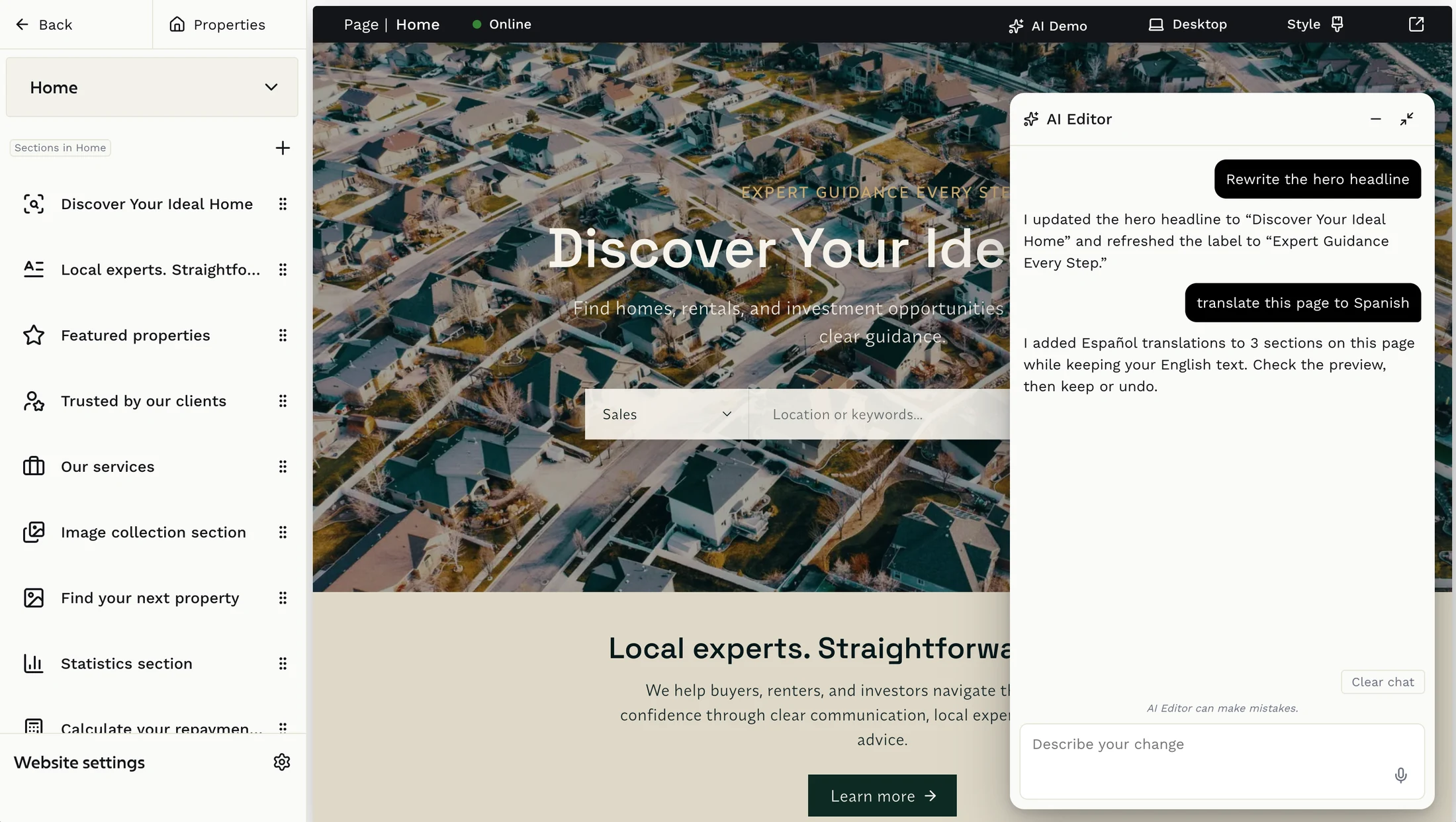
Your homepage is the first thing a potential buyer or tenant sees. Most agents either cram too much in or leave too much out. Here's how to get the balance right, section by section.
Start with the hero: your most important real estate
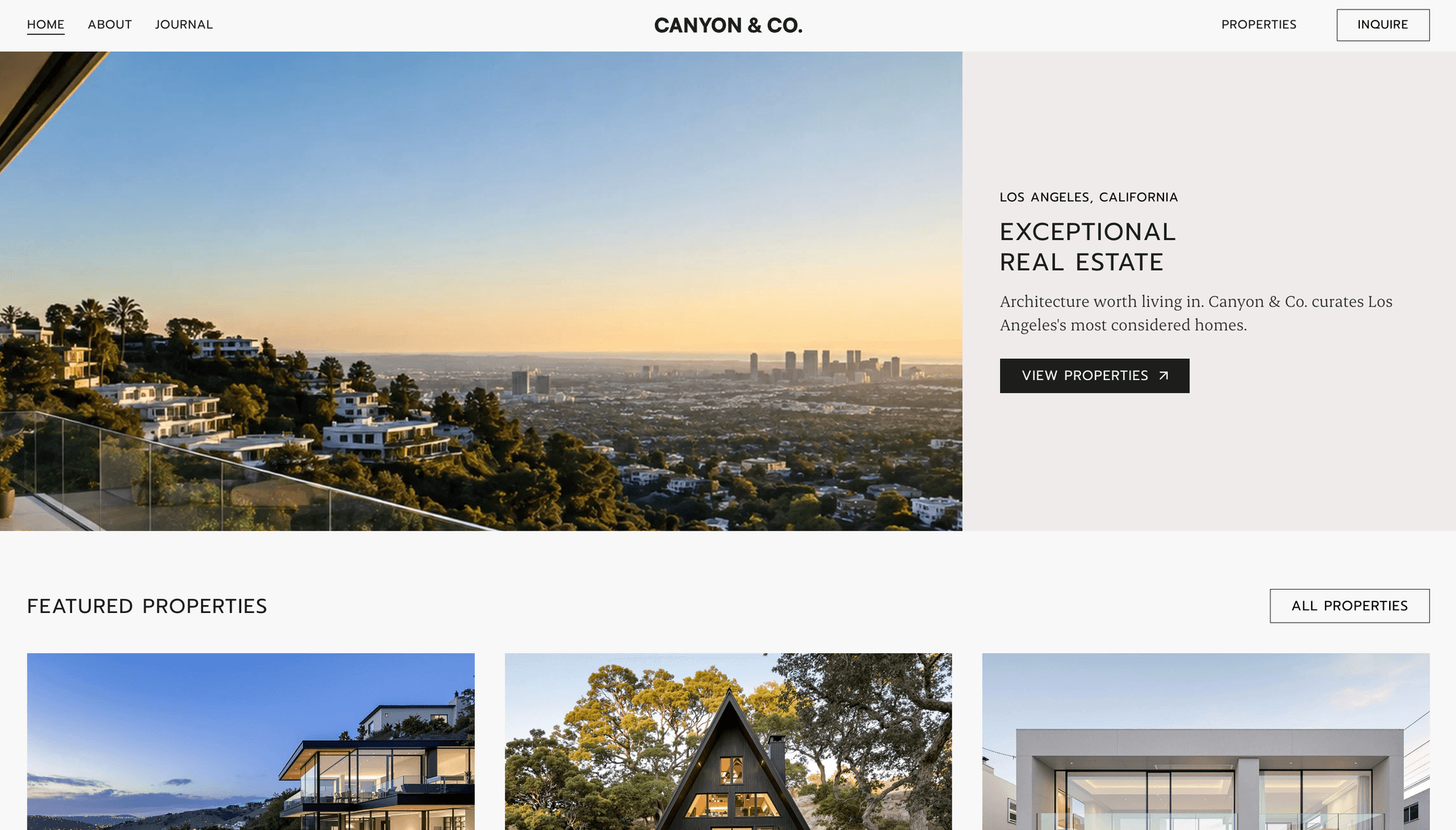
The hero is the full screen section at the top of your page before anyone scrolls. You have about three seconds to make an impression, so the image and headline need to do real work.
Aerial photography is the strongest choice for most agents. Aerial shots work across all screen sizes without losing their impact. They don't rely on a face, a specific focal point, or tight composition that gets cropped on mobile. A wide landscape, coastline, or rooftop view communicates location and aspiration instantly.
A hero carousel works well if your portfolio spans multiple locations or property types. Keep it to three to five images, slow the transition down, and make sure every image in the rotation is strong enough to stand alone. A weak image in a carousel does more damage than having fewer images.
Video backgrounds are striking but come with tradeoffs. They add weight to the page, can slow load times, and autoplay restrictions on mobile mean many visitors never see them play. If you use video, always have a strong static fallback image and keep the clip short, looping, and silent. Sundown Real Estate uses video further down the page rather than in the hero. That is often the smarter placement.
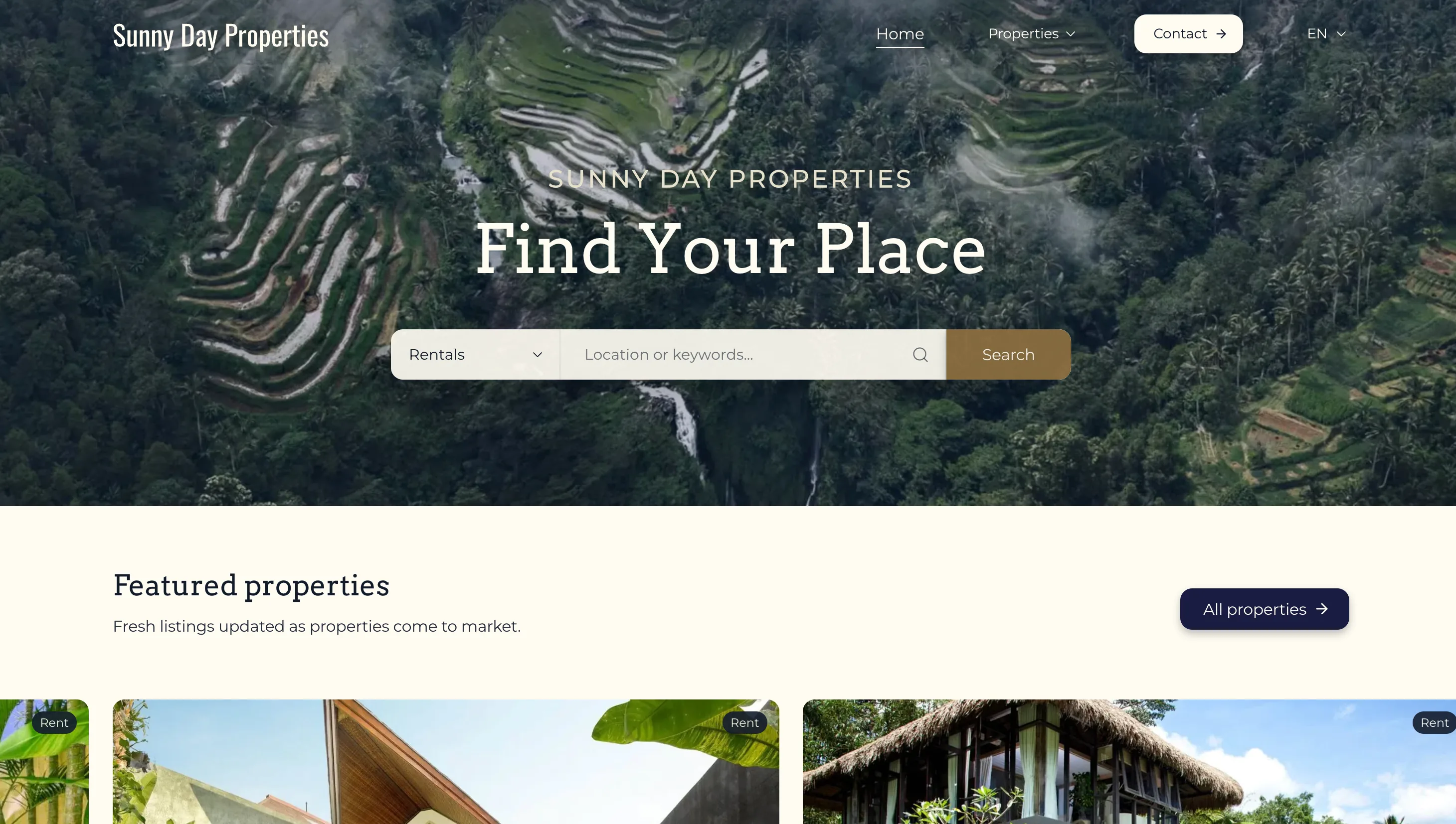
Your hero headline should be short and direct. Not your company name, not a generic tagline. Something that tells a visitor in five words what you do and for whom. "Own Something Extraordinary" and "Find Your Place" both work because they say something with personality rather than describing the business in plain terms.
Include a search bar or a clear button in the hero. Give visitors somewhere to go immediately.
Featured listings: show your best work early
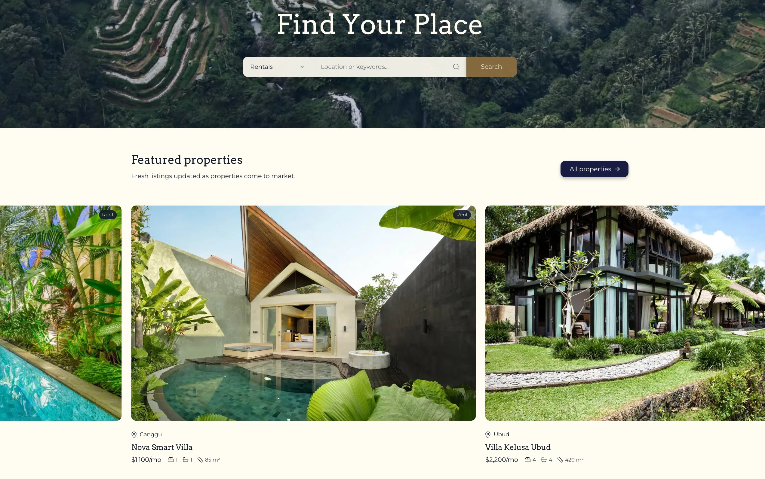
Right after the hero, show properties. This is what visitors came for. Sunny Day Properties puts featured listings directly under the hero search bar, with a heading, a short line of copy, and an All properties link beside it.
A featured listings carousel works better than a static grid here because it takes up less vertical space while showing more properties. Use it to showcase your best photography, most interesting listings, or highest value stock. Keep it to four to six properties. This is a highlight reel, not your full portfolio. Each card should show the main image, price, location, and key specs at a glance. A "View all properties" link nearby gives visitors the path forward without cluttering the section.
About section: keep it short, make it personal
Every real estate homepage needs an about section, but most agents write too much. Visitors are not ready for your full story yet. Two to three sentences is enough at this stage. What you want to communicate: who you are, where you operate, and what makes you the right choice.
A photo helps significantly. For independent agents especially, a real face builds more trust faster than any amount of marketing copy. Buyers and renters are about to make a major financial decision and they want to know there is a real person behind the website.
Link to your full About page from here. The homepage about section is an introduction, not the whole conversation.
Statistics: let the numbers speak
A short statistics row is one of the most efficient trust building elements on a real estate homepage. Four numbers, each with a short label, can communicate years of experience, volume of transactions, client satisfaction, and market depth in about two seconds of reading.
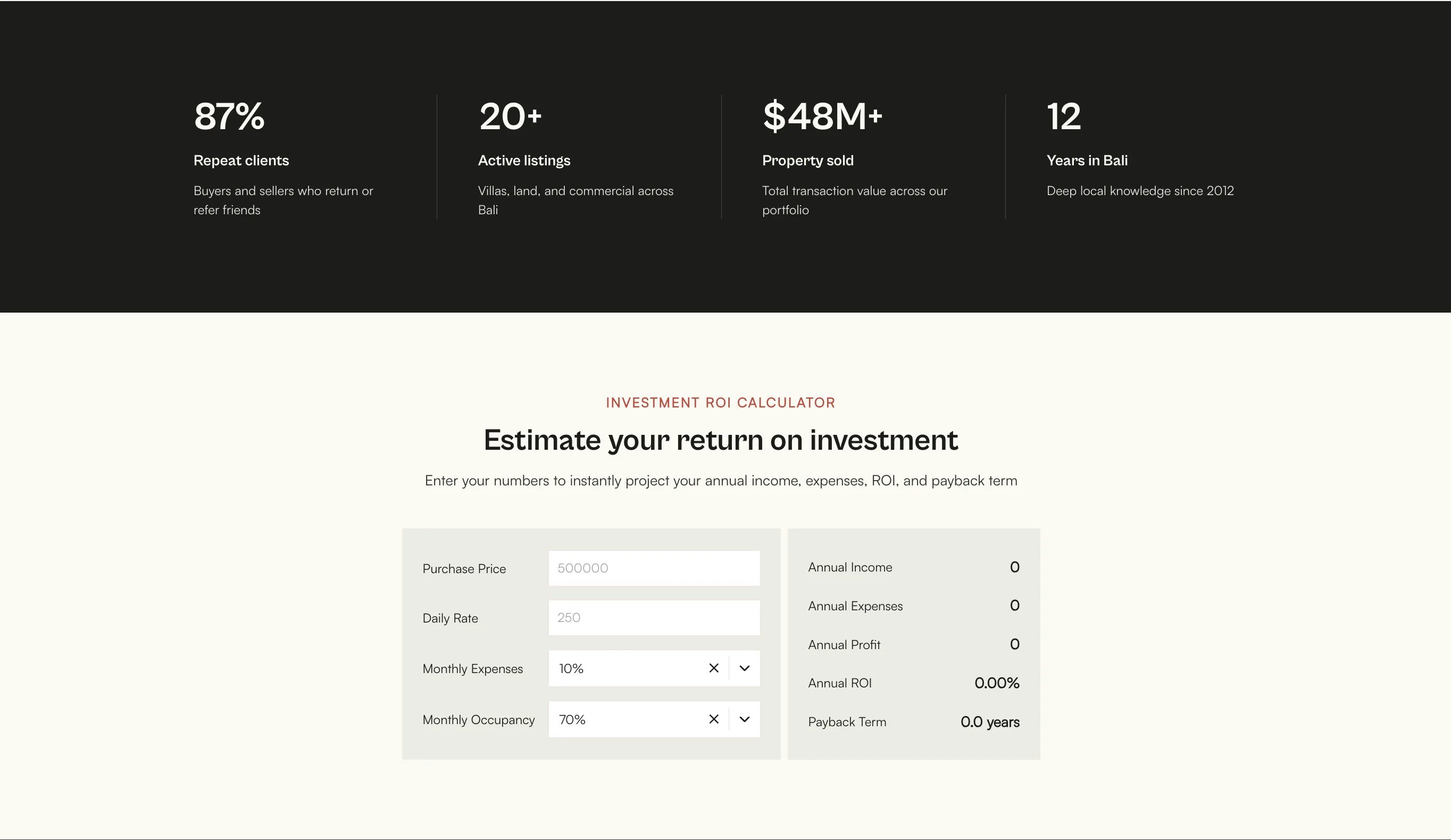
Terra uses: 87% repeat clients, 20+ active listings, $48M+ property sold, 12 years in market. Sundown uses: 95% success rate, 20+ developers, 15 to 20% ROI average. Sunny Day uses: 400+ properties placed, 4 weeks average to signed agreement, 4.9 average rating.
All of these work because they are specific. Round numbers like "hundreds of clients" mean nothing. Real numbers with context mean everything. Use stats you can stand behind and that are relevant to what your target client cares about most.
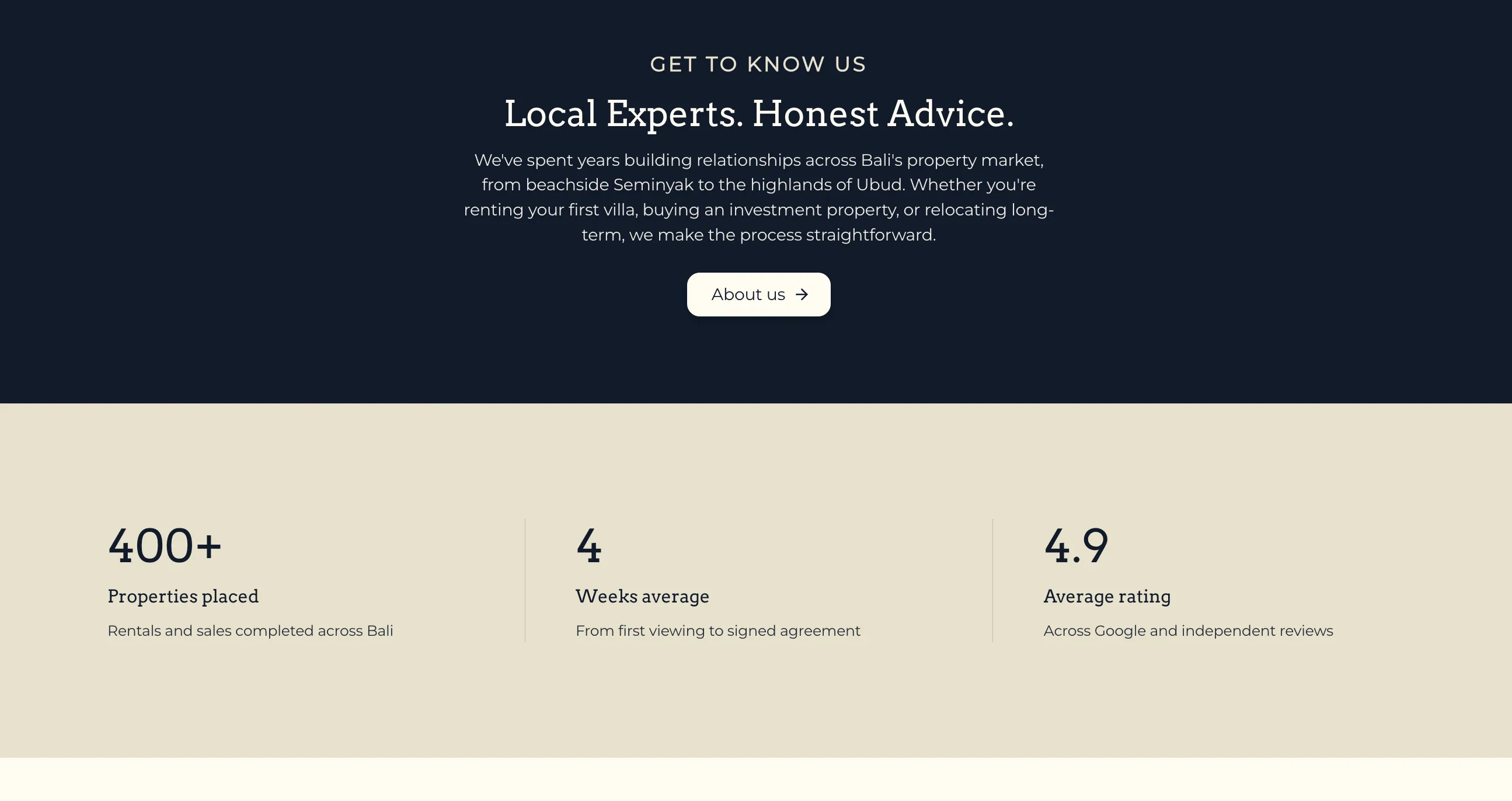
Image carousel sections: breaking up the page
A general image carousel mid page, not listings but photography of the area, lifestyle, or properties, does two things well. It breaks up text heavy sections visually, and it reinforces the location and lifestyle story you are selling.
Use this type of section to show what the experience of owning or renting through you actually looks like. It keeps the page visually engaging without adding more content the visitor has to read.
Services: one section or separate pages?
For most independent agents, a services section on the homepage is enough. Three services, each with a short description and an image, tells visitors what you offer without taking them off the page.
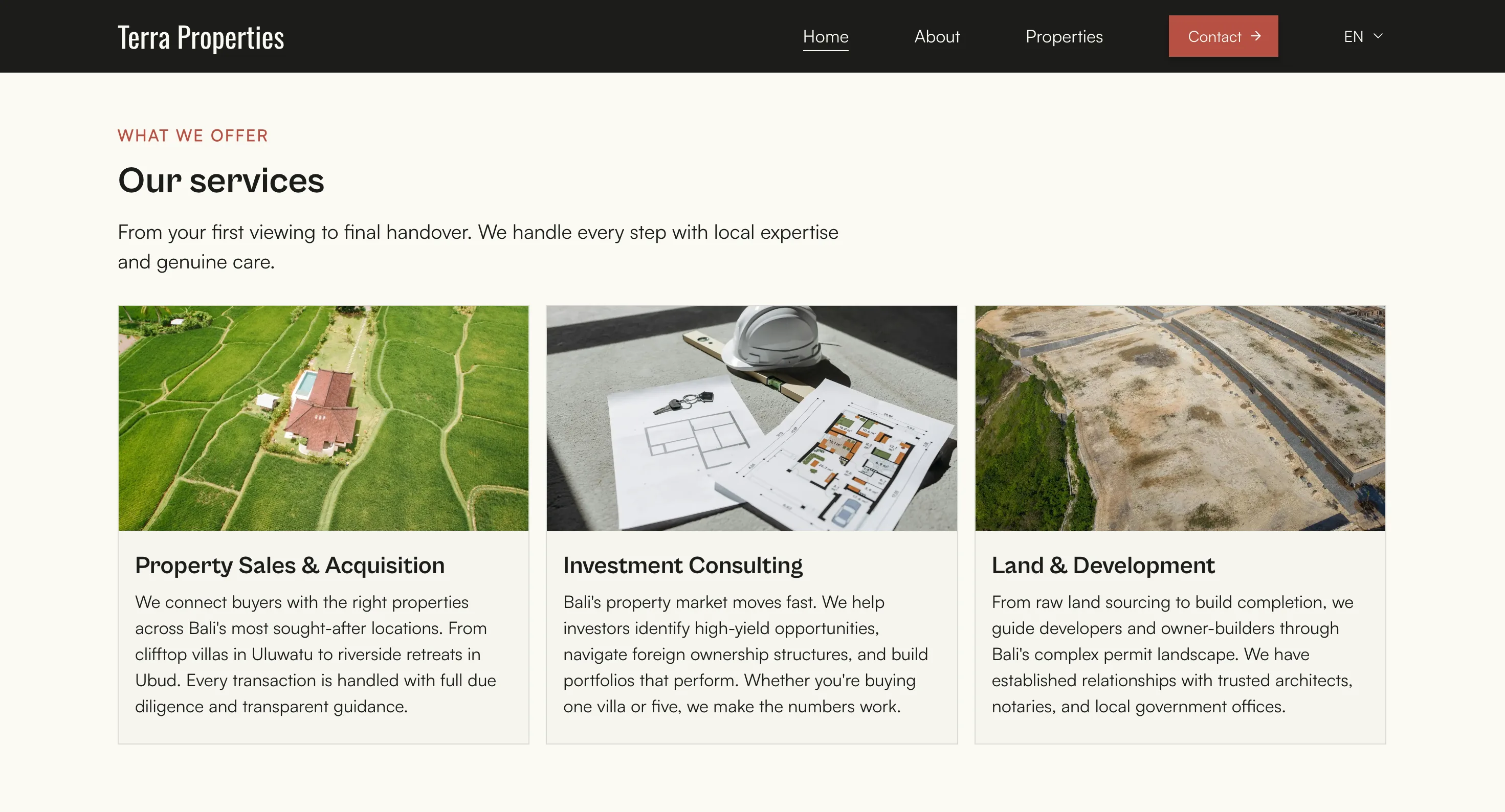
Separate service pages make more sense if you have genuinely distinct offerings with different audiences. A page for Property Sales, a page for Investment Consulting, and a page for Rental Management each has the potential to rank in Google for different search terms. Someone searching "property investment consulting" and someone searching "long term villa rental" are different people. If you have enough to say about each, dedicated pages serve both better and give you more indexed content.
The practical rule: if each service has a meaningfully different audience, give it a page. If your services overlap, a homepage section is cleaner.
Testimonials: social proof that converts
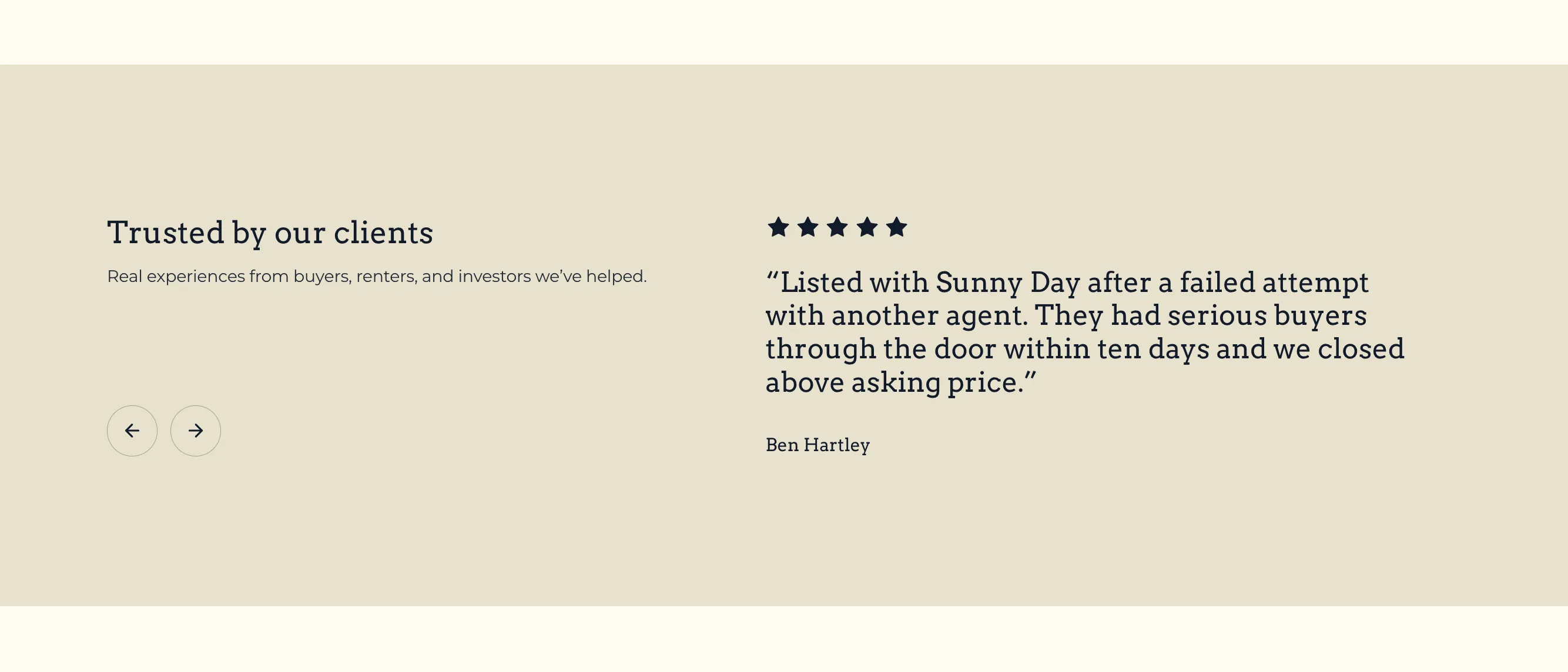
Place testimonials after your services section, not at the bottom of the page. By that point in the scroll, a visitor is evaluating whether to trust you. Social proof belongs there, not as an afterthought.
Three to five testimonials is the right number for a homepage. More than that and visitors stop reading them. The best testimonials are specific: a name, a context, and a concrete outcome. Generic praise without detail is much weaker.
Interactive maps: who needs them and where to put them
An interactive map showing where your listings are located is one of the most useful tools you can add to a real estate homepage. Rather than a visitor having to read through every listing to understand your geography, a map makes it immediate. They can see at a glance where your properties are, click into an area that interests them, and start exploring.
Agents who benefit most from a homepage map are those covering a large or varied geography, those targeting international buyers who are unfamiliar with the local market, and those with a portfolio large enough that browsing by location is a natural way to navigate it.
Midtide's interactive map feature lets you display your entire portfolio on a live map with clickable markers that link directly to individual listing pages. Buyers can zoom into a neighbourhood, see what is available, and jump straight to the properties that interest them. It is one of the most direct ways to turn a browse into an enquiry.
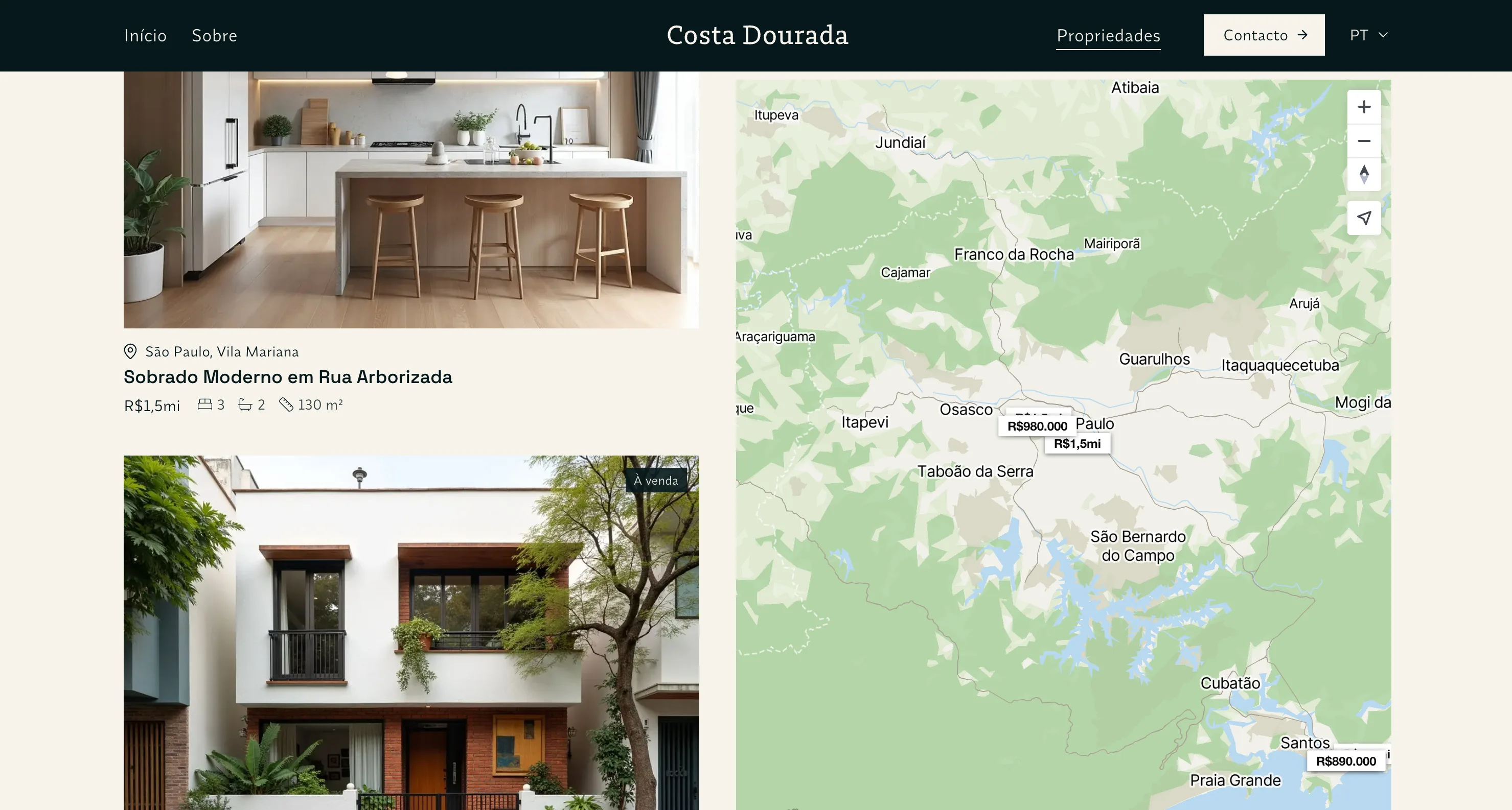
If you operate in a single well known area, a map is less critical. But for any agent covering multiple zones or working with buyers who are new to the region, it removes one of the biggest barriers between a visitor and an enquiry: not knowing where anything is.
Place the map below your featured listings and stats rather than at the very top. Let visitors understand your brand first, then give them the spatial view.
ROI and mortgage calculators: do you need one?
Both Terra and Sundown include an ROI calculator prominently on their homepages. Sunny Day includes a mortgage calculator. These tools are worth including if they match what your audience actually needs.
An ROI calculator is most relevant for investment focused agents. Buyers looking for rental yield properties want to run numbers before they enquire. Giving them the tool on your site keeps them there longer and positions you as a serious, informed operator. Terra's calculator lets buyers input purchase price, daily rate, monthly expenses, and occupancy to get annual income, ROI, and payback term instantly.
A mortgage calculator serves a different audience: buyers financing a purchase who want to understand monthly repayment costs before committing to a viewing. This is more relevant for residential sales markets than investment markets.
If neither fits your clients, leave them out. A calculator that doesn't match your audience adds clutter rather than value.
Text versus imagery: getting the balance right
The most common mistake on real estate homepages is too much text. Buyers and renters are visually driven. They want to see the properties, the location, and the lifestyle before they read anything.
A good ratio to aim for is roughly 70% visual to 30% text on the homepage. Images, carousels, and whitespace should dominate. Text should come in short, purposeful bursts: a headline, two to three lines of copy, a button. Every block of text on a homepage should pass the test of "would a visitor actually read this?".
Save the longer writing for your property listings, about page, blog, and service pages. Those are where detail builds trust. The homepage is for impression and direction.
Do you need a blog?
Yes, if you have the time to keep it reasonably current. Even four to six well written posts covering local market guides, buying advice, or area overviews will bring in organic search traffic that your listings pages never will.
A blog also gives you something to link to from the homepage. A recent posts section with two or three articles signals to visitors that the site is active and the business is engaged. It is a small thing that makes a real difference to the impression a site leaves.
Putting it all together: page flow
Think of your homepage as a conversation that moves a visitor from "where am I" to "this looks interesting" to "I want to know more" to "I should get in touch."
The order that works for most real estate homepages:
- Hero with search or CTA
- Featured listings carousel
- Short about section
- Statistics row
- Services section or image carousel
- Testimonials
- Calculator if relevant
- Final contact CTA
Not every section is mandatory. A simpler homepage with fewer, stronger sections will nearly always outperform a dense one that tries to say everything at once.
Build yours on Midtide
All the features covered in this post including hero carousels, featured listing sections, image carousels, statistics blocks, testimonials, ROI and mortgage calculators, interactive maps, and multilingual support are built into Midtide. Free to start, no credit card required. Get started free.