Luxury on the web is mostly subtraction. Fewer colours, more space, and motion used once rather than everywhere. Here's how that plays out in practice, how to apply it to your own site, and which bits of the convention are worth ignoring.
A palette of almost nothing
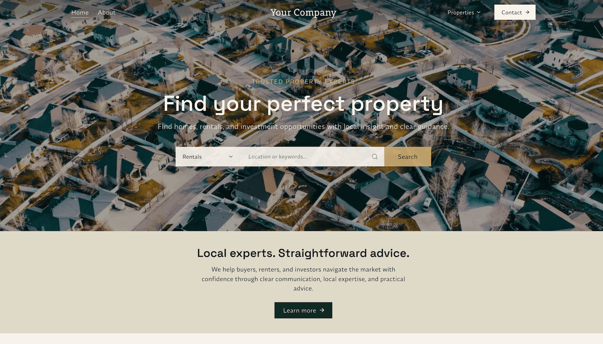
None of these sites have a brand colour in the way most businesses mean it. There's a warm off-white, a near black, and a mid grey for secondary text. That's the entire palette.
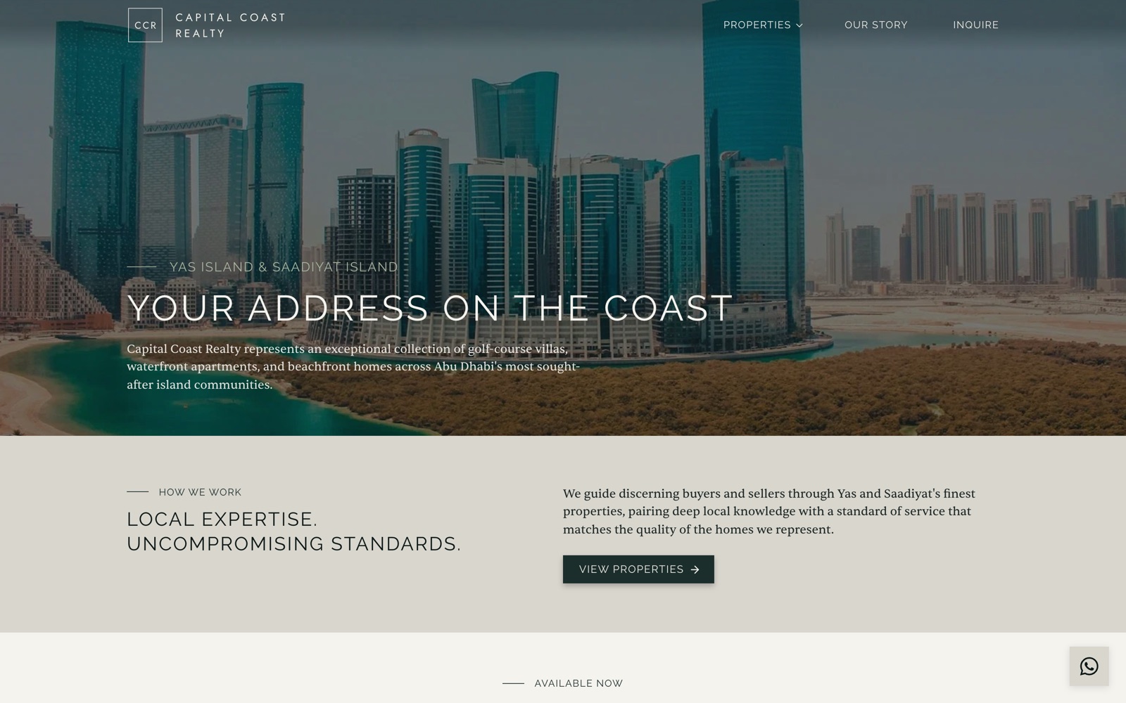
The colour comes from the photography. A Dubai marina at dusk, a Los Angeles hillside at golden hour, teal towers on the Abu Dhabi coast. If the interface itself stays neutral, every bit of colour on screen belongs to the property, which is what you're actually selling. Add a brand blue to the buttons and you're now competing with your own listings for attention.
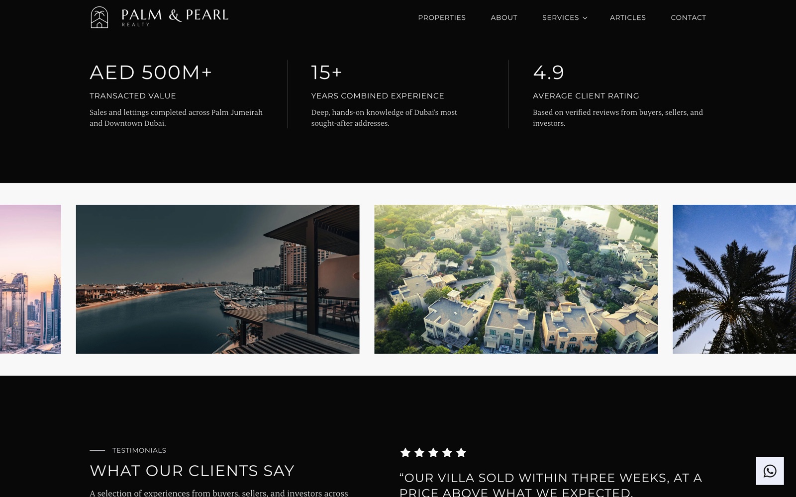
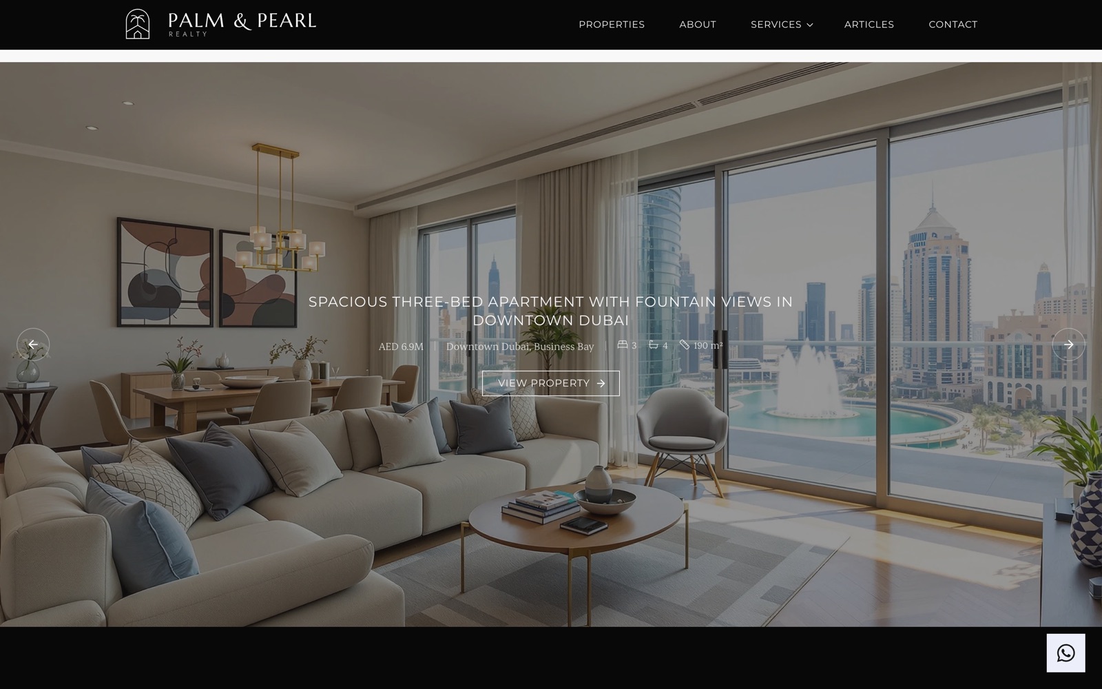
The one place these sites do commit is contrast. Palm & Pearl drops to a near-black band for its numbers, with hairline rules between each figure. Against an otherwise pale page it lands hard, without a single accent colour involved.
Type set wide and light
The headlines on all three sites share a formula: uppercase, set at a regular weight rather than bold, with the letters given room to breathe. It's a look that echoes fashion and auction house typography, where wide, quiet capitals do the work that heavy type does elsewhere.
The reasoning is simple enough. Bold, tightly set type shouts, and shouting is cheap. Letting the letters breathe suggests the words don't need to fight for your attention.
The body copy then does the opposite. Where the headings are wide sans-serif capitals, the paragraphs are a serif at a comfortable reading size. The contrast between the two is what stops the page feeling like a single flat block of text.
- Uppercase headings, regular weight. Skip bold. Light and wide reads more expensive than heavy.
- Letter-spacing on anything uppercase. Capitals set at default tracking look cramped. Small labels need it most.
- A serif for body copy. It signals editorial rather than app, and it's easier to read long.
- Small caps labels above headings. All three sites use a short eyebrow with a rule beside it: OUR PHILOSOPHY, HOW WE WORK, LOS ANGELES, CALIFORNIA. It orients the reader without another headline.
Corners, chosen once
Corner radius is the smallest decision on this list and the one people argue about most. It is worth getting right, but it is worth getting right after the photography, the palette and the type, not before.
Rounded corners read as friendly and approachable, which suits consumer software. A sharp corner reads as precise and deliberate, closer to a gallery invitation than a shopping app. Neither is better in the abstract, but they set different expectations before a visitor has read a word.
The three sites here mostly lean square, and it suits the severe, gallery-like register they are going for. Plenty of high-end brands go the other way, pairing soft curves with warm materials and muted colour to read as comfortable and established rather than austere. A coastal Mediterranean agency or a traditional English country estate practice might reasonably land there and be no less expensive-looking for it.
What matters more than the value you pick is that you pick one and hold it. Mixed radii are what actually reads as cheap: a square button next to a pill-shaped input next to a softly rounded card suggests nobody decided. Note that a few elements will sit outside whatever you choose, because convention is stronger than consistency for them. Carousel arrows and floating chat buttons are usually circular wherever you put them, and forcing those into squares looks stranger than the inconsistency does.
Motion, used once
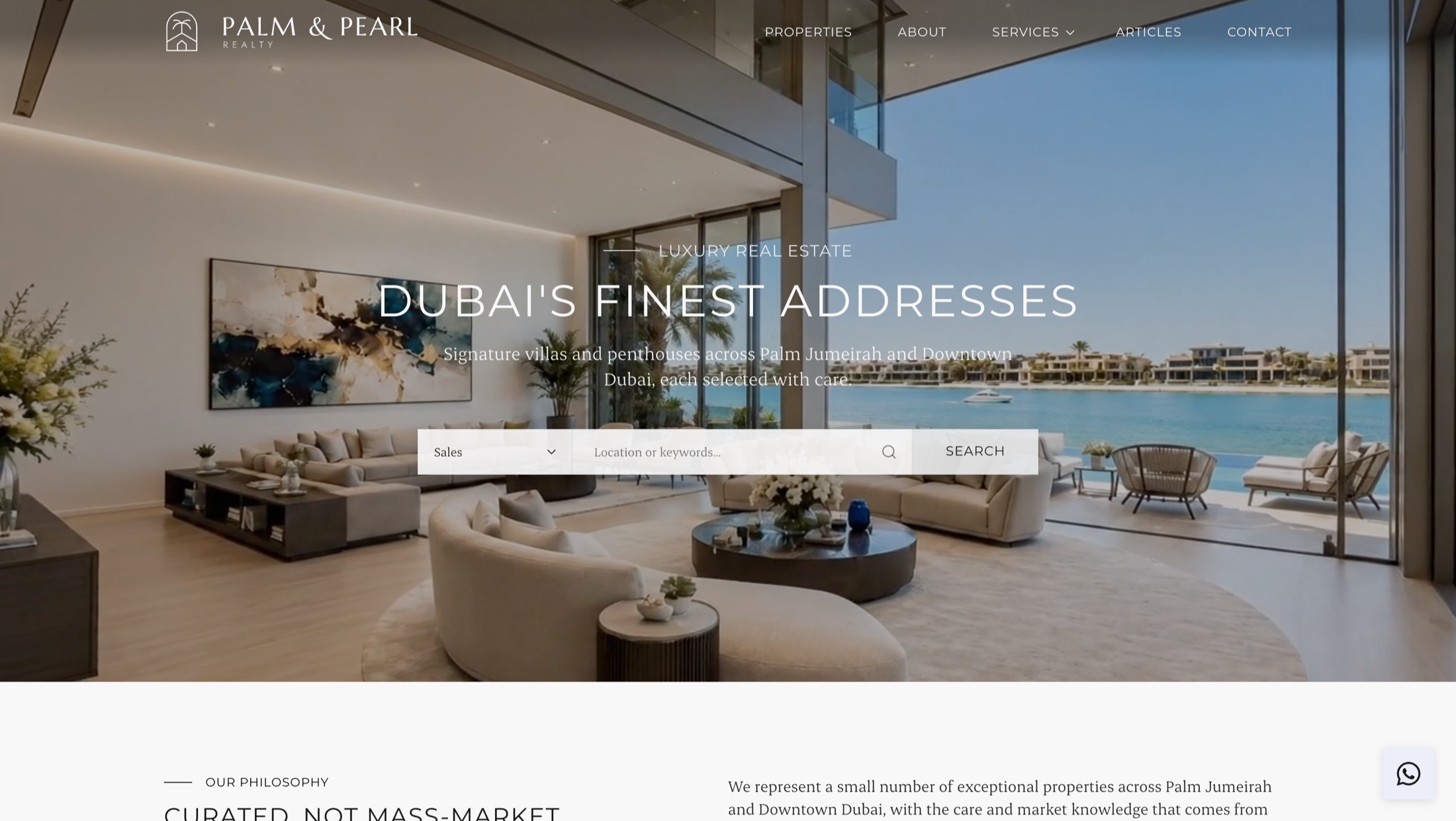
Palm & Pearl runs a background video in its hero: autoplay, muted, looping. It's the only moving thing on the page. Nothing else slides in, counts up, or fades on scroll.
That restraint is the point. A single piece of motion in an otherwise still page reads as cinematic. Fifteen scroll animations read as a template. If you're going to use video, spend it on the first thing a buyer sees and leave the rest of the page alone.
Keep it muted and looping so it behaves like a moving photograph rather than something demanding to be watched. And keep it short. A slow pan across a terrace at golden hour does more than a two minute edit nobody finishes.
Space is the expensive part
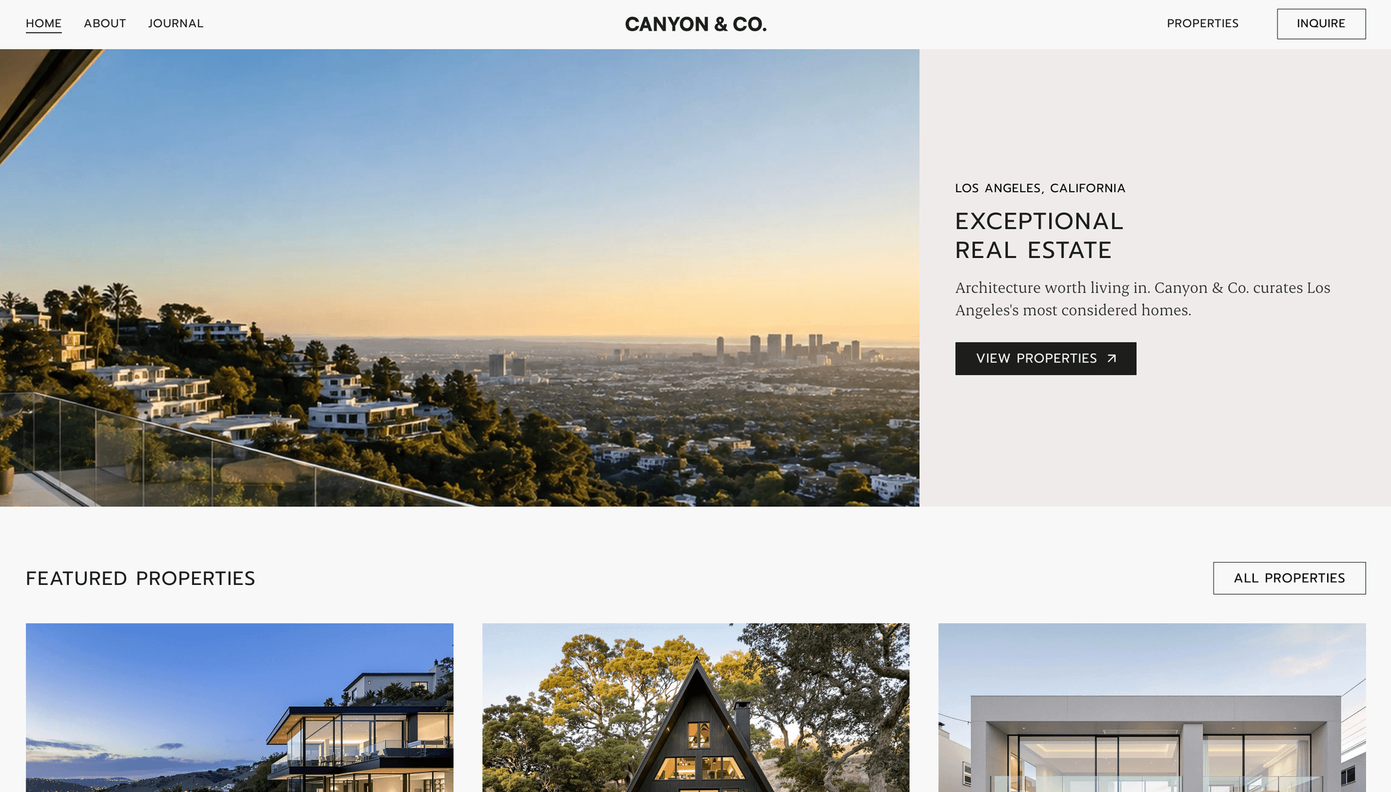
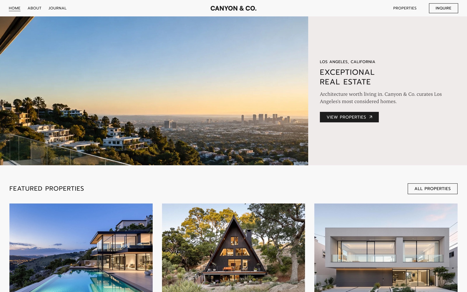
Canyon & Co. splits its hero down the middle: photograph on the left, and on the right a pale panel holding a location label, two lines of headline, one sentence, and a single button. Nearly half of that panel is empty.
Empty space is the clearest signal that you aren't desperate. A page crammed with badges, offers and calls to action reads as a business that needs the sale. A page with one photograph, one sentence and one button reads as a business choosing its clients. For an agency selling at the top of a market, that impression matters more than any feature list.
Notice also that the hero is not centred. The photograph takes roughly two thirds and the text panel sits off to one side, which is a decision rather than a default. Centring everything is what happens when nobody chooses: it is the resting state of every template and every unstyled document, and the eye reads it as such. Deliberate asymmetry, held to a consistent grid, is the opposite signal. The galleries do this constantly, and if you look at how Gagosian or David Zwirner build a page you find strict twelve column grids with blocks pushed deliberately off centre. The grid is what keeps it from looking like a mistake.
Listings that behave like a catalogue
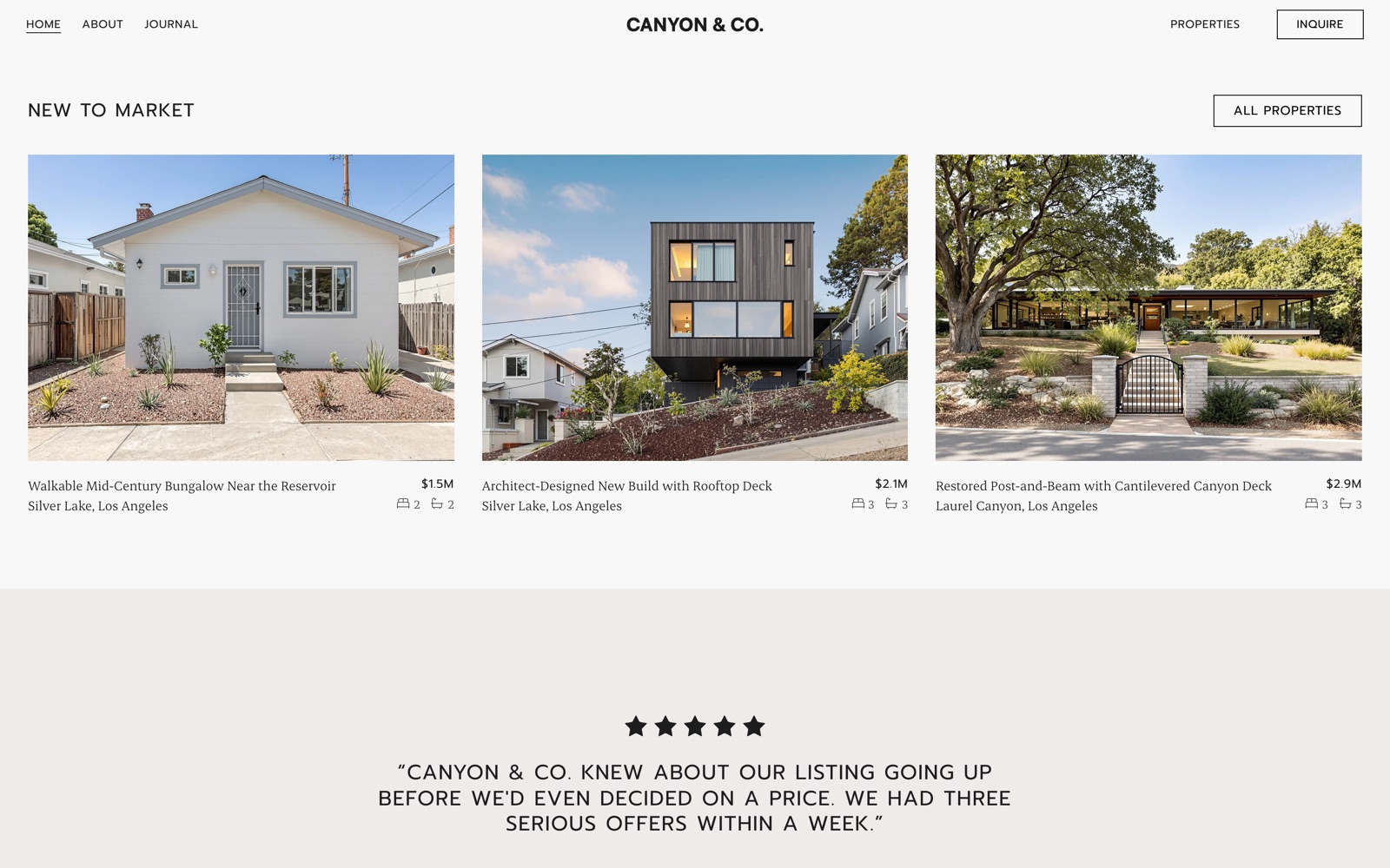
The property cards on these sites have no borders, no shadows, and no rounded corners. Just the photograph, the title, the location, the price, and the bed and bath counts in small type underneath.
Most listing grids do the opposite. Cards get a border, a drop shadow, a coloured status badge, a heart icon, an agent thumbnail and a hover lift. Each addition is defensible on its own and the total looks like a portal. The moment your site looks like a portal, you're competing on volume, which is not the game a luxury agency is playing.
Strip the chrome and the photograph gets bigger, which is the only thing on the card a buyer really came for.
One rule holds the grid together: every card uses the same aspect ratio. It sounds trivial and it is the difference between a considered grid and an obvious CMS. Mixed ratios give you a ragged bottom edge and rows that don't align, which reads as whatever the photographer happened to send, uploaded without a second thought. Gagosian and Loewe both do exactly this on their own sites, locking one ratio across a set while letting a single feature image keep its native proportions. Pick a ratio, crop everything to it, and let the hero be the exception.
Ask, don't sell
Look at the button in the top right of Canyon & Co.: INQUIRE. Not Get Started, not Book a Viewing Now, not Find Your Dream Home. One word, and it asks rather than sells.
This is the standard vocabulary at the top of every market. Aston Martin and Bentley say Enquire and Register Interest, and neither publishes a price. Sotheby's says Request an Estimate. Aman says Reserve rather than Book Now. The verb does real work: something you buy is a commodity, something you enquire about is an acquisition, and the second framing suits a house at three million rather better than the first.
The same instinct rules out the entire urgency toolkit. No countdown, no Only 2 Left, no Just Listed! badge, no exclamation marks anywhere. Urgency mechanics tell a buyer you need the transaction more than they do, which inverts the relationship you have spent the whole page building. Where a portal would write Going fast, a luxury site states the fact flatly and leaves it there.
Friction belongs in one place only
There is a persistent misreading of all this, which is that luxury means making things harder. It doesn't. It means putting the effort in the decision and taking it out of everything else.
An enquiry form that routes to a named person instead of an instant booking widget is chosen friction, and it reads as ceremony. A search that returns nothing, a floor plan that takes eight seconds to load, or a phone number you have to hunt for is unchosen friction, and it just reads as incompetence. Nielsen Norman Group watched a shopper browsing a four thousand dollar Cartier bracelet get interrupted by a feedback popup; her reaction was that it felt tacky and made her think less of Cartier. Nothing about that popup was luxurious, and the same is true of every obstacle a visitor did not choose.
Practically, for an agency site: make the enquiry considered and personal, and make everything else effortless. Prices, locations, square footage, floor plans and the agent's actual phone number should be immediate. Baymard's benchmark of luxury retailers found search was where they underperformed most, which is a strange place for an expensive brand to be losing.
Photography decides the outcome
Everything above is worth saying, and none of it survives bad photography. These three sites work because the images are consistent: shot at similar times of day, similar colour temperature, similar framing. Wide, level, unhurried.
A minimal design has nowhere to hide. If your interface is neutral and your type is restrained, the photographs carry the whole page, and one phone snap at midday with a wonky horizon will undo the rest. If your budget is finite, spend it here before anything else.
Where this goes wrong
Two honest caveats, because a list of rules like this is easy to over-apply.
The first is that restraint without craft reads as unfinished rather than confident, and these principles are not independently additive. Generous margins around a mediocre photograph look worse than tight margins around the same photograph, because the empty space invites exactly the inspection the image cannot survive. Every rule here raises the standard the rest of your material has to meet.
The second is that a few habits borrowed from luxury sites are straightforwardly bad, and get copied because an expensive brand did it first. Pale grey body text on white is the common one: it looks refined in a mockup and it fails contrast requirements, which matters more when a good share of your buyers are over fifty. Hiding the desktop navigation behind a menu icon is another; Nielsen Norman Group measured desktop users taking about forty percent longer to find things that way. Removing the underline from links and the focus outline from buttons is a third, and that one is an accessibility failure rather than a style choice. Keep the restraint for type, colour, spacing and imagery, where it costs nothing. Leave navigation, contrast and anything a visitor has to click alone.
Worth saying plainly: none of this is backed by a controlled study showing that square corners or wide tracking make anyone pay more. These are conventions of the category, and they work largely because buyers at this level have been trained by every other expensive brand to recognise them. That is a real effect, but it is a different claim from a proven one, and it is worth knowing which you are relying on.
The short version
- Fix the photography before you touch anything else. Nothing below survives without it.
- Cut your palette to an off-white, a near-black, and one grey. Let the properties supply the colour.
- Set headings in wide uppercase at a regular weight, and body copy in a serif.
- Use motion once, in the hero, muted and looping.
- Leave more space than feels comfortable, then leave a bit more.
- Place things off centre, but hold them to a grid. Centred is what happens when nobody decides.
- Take the borders, shadows and badges off your listing cards, and crop every card to one aspect ratio.
- Say Enquire rather than Buy Now, and drop the urgency badges entirely.
- Put the friction in the enquiry and nowhere else. Prices, floor plans and phone numbers stay immediate.
- Pick a corner radius, apply it everywhere, and stop thinking about it.
None of this requires a developer. Every site above is a Midtide site, built from a template and adjusted in the editor: colours, fonts, letter-spacing, corner radius, section layouts, and a background video in the hero. The design decisions are yours. The build is an afternoon.
Want a site that looks like these? Browse the templates or talk to us about your brand. We'll have you live this week.